The Vintage Christian Aesthetic: What It Is and Why It Resonates
Store Team
The Vintage Christian Aesthetic: What It Is and Why It Resonates
"Aesthetic" is an overused word. It gets applied to any loosely coherent mood board, any vague color preference, any set of Instagram filters that happen to cluster together. Here, it earns its place. The vintage Christian aesthetic is not a mood board trend. It is a coherent visual language with specific historical roots, identifiable components, and a recognizable feeling it produces in people who encounter it. Understanding what it actually is — not just what it looks like — explains why it continues to resonate in 2026 with a generation that never lived through the era it draws from.
Defining the Vintage Christian Aesthetic
The vintage Christian aesthetic is the visual language of the 1970s Jesus Movement translated into contemporary design. That origin point matters. The Jesus Movement was a specific cultural moment: young people in the late 1960s and early 1970s, many of them countercultural dropouts, finding genuine Christian faith and expressing it through the design sensibility of their moment — hand-drawn art, earthy colors, organic typography, folk-influenced imagery.
The aesthetic that emerged from that movement was unpretentious because the people making it were unpretentious. They were printing shirts on manual presses in basements and communes. They were drawing logos by hand. The worn-in quality was not designed — it was the natural result of the production methods and materials of the era.
Contemporary vintage Christian design draws from that heritage deliberately. The "vintage" quality is no longer accidental — it is designed to evoke the authenticity of that original moment. The best vintage Christian design does this honestly, working from a genuine understanding of what made the Jesus Movement aesthetic feel the way it did, rather than simply copying surface characteristics.
This is the distinction between heritage-rooted design and trend-driven imitation: one knows why the aesthetic works; the other only knows what it looks like.
The Color Palette
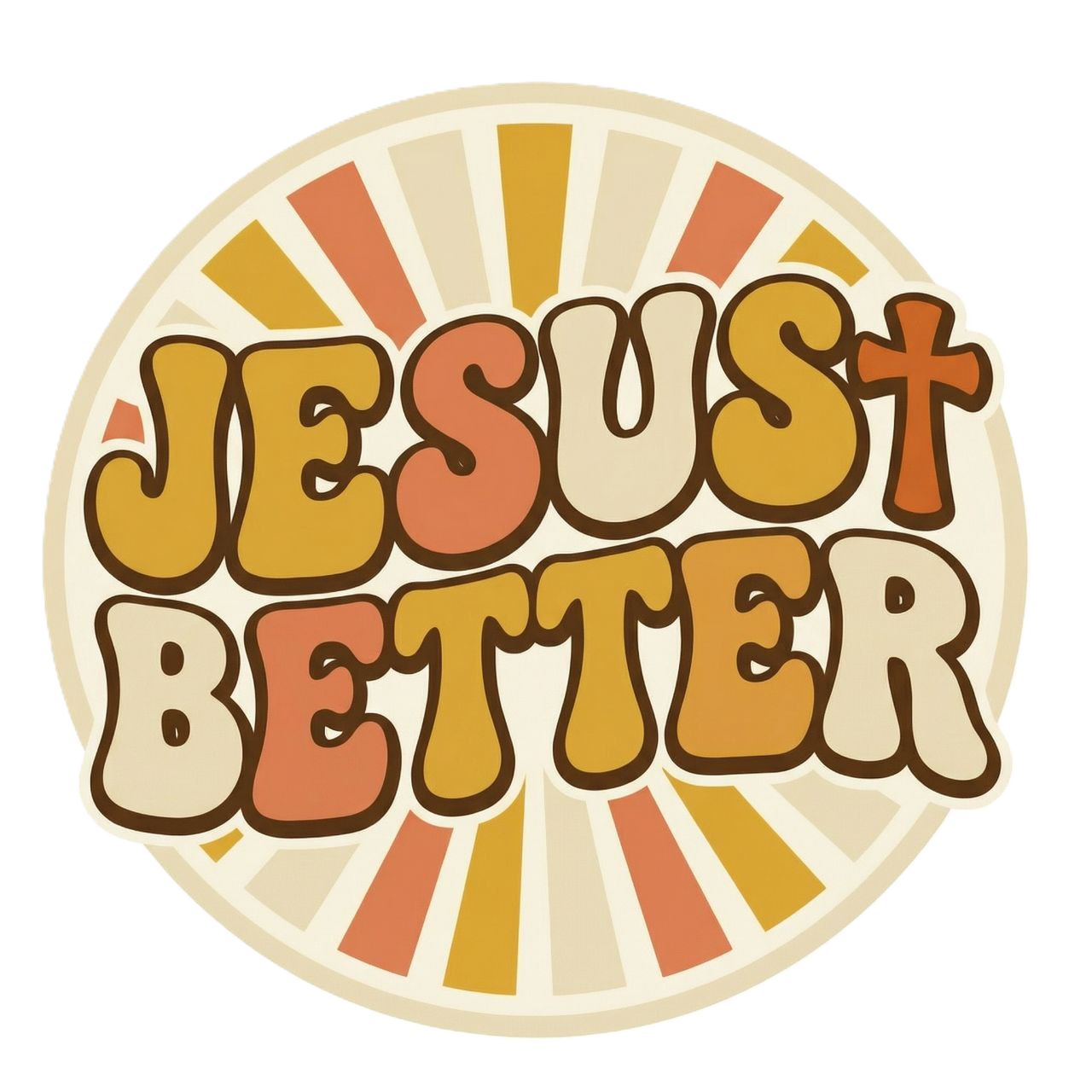
The vintage Christian color palette is earth-based, warm, and deliberately un-flashy. Each color in the core palette carries specific resonance.
Mustard yellow. The warmest of the core palette colors, mustard yellow carries associations of harvest, abundance, and sunlight. It reads as generous and grounded — not the bright optimism of primary yellow, but the deeper warmth of late-summer fields.
Burnt orange. Burnt orange is the color of the Southern California sunset, and that geographic and cultural connection matters. The early Jesus Movement was centered in Southern California — Calvary Chapel in Costa Mesa, the beaches of Orange County, the communities along the Pacific coast. Burnt orange carries that origin.
Terracotta. Earth-colored, grounded, connected to the physical world. Terracotta speaks to the organic, the handmade, the rooted. It is the color of clay pots, of desert soil, of things made by hand rather than manufactured at scale.
Sage green. Nature, simplicity, quietness. Sage green in vintage Christian design creates breathing room — it is the color of something living but unhurried.
Cream. Softness, light, warmth without heat. Cream backgrounds and cream typography read as gentle and considered, never harsh or corporate.
Warm brown. Steadiness, rootedness, permanence. Warm brown anchors the palette, providing depth and reliability.
What these colors have in common: they are all pulled from the natural world, and they are all warm. There are no cool neutrals in the vintage Christian palette. There is no grey, no slate, no cool white. And there are no neons, no primary brights, no colors that feel synthetic or manufactured. When a "vintage Christian" piece appears in neon or primary colors, it is signaling immediately that the designer does not understand the aesthetic they are attempting — those colors belong to a different visual tradition entirely.
The Typography
Typography is where vintage Christian design either succeeds or fails at authenticity. The typefaces of the Jesus Movement era were bold, readable, and often imperfect — hand-lettered or set in vintage display typefaces that carried the texture of their era.
Slab serif. Heavy, sturdy, readable at a distance. Slab serif type carries authority without formality — it is the typography of American signage, of woodblock print, of vernacular design that was built to be seen. Faith messages printed in slab serif read as confident and direct.
Hand-lettered scripts. The hand-lettered quality of much Jesus Movement design came from necessity (many early pieces were literally hand-lettered) and became a defining characteristic. Contemporary vintage Christian design replicates this hand-quality deliberately, using scripts that maintain the slightly irregular, organic quality of actual hand lettering.
Distressed letterforms. Letterforms that appear worn, slightly incomplete, rough at the edges. The distress is intentional in contemporary design — it evokes the natural aging of printed materials, the way real vintage type looks after years of use.
The legibility principle: Faith messages need to be readable. The vintage Christian aesthetic never sacrifices legibility for visual effect. The typography serves the message, not the other way around. This is part of what separates genuine vintage Christian design from designers who treat the aesthetic as decoration.
The Illustration Style
Hand-drawn line art is the dominant illustration mode in vintage Christian design, and its dominance is rooted in the same historical reality as the color palette: the original Jesus Movement designers were working by hand, with limited tools, producing work that was necessarily illustrative rather than photographic.
The illustration style is folk-art influenced — simplified forms, bold outlines, expressive rather than realistic. The subject matter draws from Christian iconography (the cross, the dove, the fish, the lamb, hands in prayer) rendered in a vernacular rather than ecclesiastical style. These are not the illustrations of high church tradition. They are the illustrations of people who were new to faith and expressing it through the visual language of their own culture.
The key quality marker in vintage Christian illustration is what designers call "hand-quality" — the slight imperfections, the slightly uneven line weights, the organic irregularity that separates genuine hand-drawn work from vector-smooth digital illustration. Vector-smooth illustration can be made to look vintage through texture overlays and aging effects, but the underlying smoothness tends to show. Genuine hand-drawn illustration has an energy that smooth vectorization cannot replicate.
Why This Aesthetic Resonates in 2026
The cultural moment that vintage Christian design speaks to in 2026 is authenticity. The dominant anxiety of this cultural moment is the suspicion that everything is manufactured — that brands are performing values they don't hold, that institutions are managing appearances rather than living convictions, that nothing is quite what it presents itself as.
The vintage Christian aesthetic is the visual language of people who were not managing appearances. The Jesus Movement participants who produced the original visual materials were broke, countercultural, and genuinely convinced of what they believed. The roughness and imperfection of their design work was not a stylistic choice — it was honest evidence of who they were and what they had access to.
Contemporary vintage Christian design inherits that honesty by design. Wearing a well-made piece in the vintage Christian aesthetic is a visual declaration that your faith is not corporate, not polished for consumption, not carefully managed for brand safety. It looks like conviction because the tradition it draws from was conviction.
The backlash against polished corporate branding has been building for years. Consumers, especially younger ones, are increasingly skeptical of brands that appear to have done extensive focus-group research on how to appear authentic. The vintage Christian aesthetic sidesteps all of that because its authenticity is historical, not manufactured.
This is not a trend. It is a homecoming — the return of a visual language that speaks to genuine belief, genuine craft, and genuine care for the people who will wear the result.
Conclusion
The vintage Christian aesthetic is specific, rooted, and meaningful. Understanding its origins in the Jesus Movement, its color logic, its typographic principles, and its illustration approach explains both what makes it beautiful and why it resonates so consistently with people who take their faith seriously.
For the full history of how this aesthetic developed, read Vintage Christian Fashion: A History of the Jesus Movement Style. And for the complete guide to the vintage Christian fashion world — from styling to shopping to the culture behind the clothes — explore Vintage Christian Fashion: The Complete Guide.