70s Christian Apparel: The Jesus Movement's Lasting Fashion Legacy
Jesus Better Team
70s Christian Apparel: The Jesus Movement's Lasting Fashion Legacy
The 1970s gave Christianity something it hadn't had before: a genuinely cool aesthetic. Not manufactured cool — real, grassroots, counterculture-meets-revival cool. The 70s was the decade when young people who had been part of the hippie movement found faith, and instead of leaving their visual language behind, they brought it with them. What emerged was a style of Christian apparel that still resonates more than fifty years later — earthy, hand-drawn, personal, and honest. This is the story of where that aesthetic came from and why it keeps coming back.
The Cultural Context
To understand 70s Christian apparel, you need to understand the Jesus Movement — and to understand the Jesus Movement, you need to understand what was happening in America in the late 1960s.
The counterculture had burned bright and started to burn out. Woodstock was 1969. The optimism of the Summer of Love had given way to something more complicated. Young people who had left mainstream society looking for meaning hadn't necessarily found it in drugs or political revolution. Into that space came a grassroots Christian revival that spread through exactly the same networks as the counterculture: coffeehouses, communal living, outdoor gatherings, word of mouth.
Calvary Chapel in Costa Mesa, California became one of the epicenters. Under Chuck Smith, and with figures like Lonnie Frisbee — a genuine counterculture figure who had become a passionate evangelist — Calvary Chapel began reaching young people the church had written off. They came in off the beach, sometimes barefoot, and they were welcome. The style was informal, the music was genuine, and the faith was real.
Explo '72 in Dallas — a massive gathering of young Christians organized by Campus Crusade for Christ — brought 80,000 people together in what the press called a "Christian Woodstock." The visual similarity was intentional in some ways and organic in others. These were the same young people, wearing the same clothes, making the same hand-drawn art. What was different was what they believed.
Street evangelism became an expression of the Jesus Movement's outward energy. Young Christians stood on corners and in parks, distributing literature and talking to anyone who would listen. The tee shirt was the canvas of that message — hand-stamped, homemade, worn with conviction.
What 70s Christian Apparel Actually Looked Like
The material culture of the Jesus Movement was genuinely handmade. This wasn't a brand or a marketing campaign — it was a community of young people making things with the tools they had.
Hand-stamped logos on surplus t-shirts were common. The plain white or off-white tee was the blank canvas. Rubber stamps, simple screen-printing setups, and iron-on transfers got words and images onto fabric without a professional production facility.
"One Way" — the hand sign pointing upward — became the iconic gesture of the movement, and it appeared on apparel everywhere. The pointing finger, the upward direction: simple, universal, clear. It was reproduced in hand-drawn graphics, stamped onto tees, and worn as a button alongside faith statements.
Dove imagery was central to the visual language. The dove as the symbol of the Holy Spirit — simple enough to draw by hand, meaningful enough to carry the whole theology. Jesus Movement dove graphics had a looseness and warmth to them that distinguished them from formal religious art.
Simple cross designs — not ornate, not jeweled, not decorative — just the shape, rendered with varying degrees of rawness. The cross as statement rather than ornament.
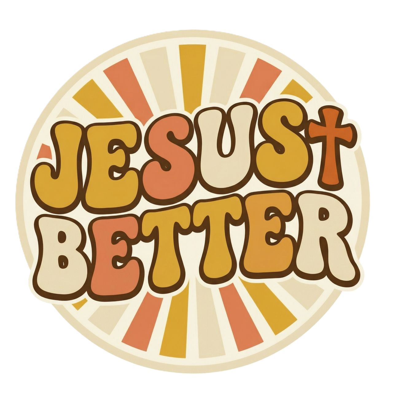
The earth-tone palette came directly from the hippie counterculture's visual language. Mustard yellow, avocado green, harvest gold, terracotta, warm brown — the colors that characterized the entire decade's aesthetic. These weren't chosen for their Christian symbolism; they were the colors that surrounded the young people who made these things.
Ministry tee shirts from specific churches, camps, and organizations became the branded artifacts of the era. They functioned like concert tees — a record of a specific community at a specific moment.
The Artists and Designers of the Era
The visual language of the Jesus Movement was created by ordinary people with modest tools — but some of those ordinary people had real gifts.
Early Christian graphic artists developed the visual vocabulary that would define the era: hand-drawn illustrations of doves and crosses, lettering styles that borrowed from the psychedelic art world and transmuted it into something with different content and different spiritual weight. The folk-art quality of this work was not a limitation — it was the point. It looked like something a person had made, because it was.
This stands in direct contrast to both the corporate religious merchandise that came before it and the slick production values that followed in the 1980s. The Jesus Movement designers weren't working to a brief. They were expressing something, and the expression was direct.
From 1970s to Today
Christian apparel went through dramatic changes in the decades after the Jesus Movement. The 1980s brought sophistication in production alongside a loss of that raw, personal quality. The 1990s produced WWJD as a mass-market phenomenon. The 2000s saw the independent craft revival begin to push back against commercialization.
But the 70s aesthetic is the era that keeps coming back. Not the 80s Christian aesthetic. Not the 90s one. The 70s.
The reason is the authenticity principle: the 70s Jesus Movement wasn't selling anything except the faith itself. The apparel emerged from communities making things for their own use and as expressions of genuine belief. There was no market strategy behind the hand-stamped tee. That's what gives the aesthetic its staying power — it reads as real because it was.
When contemporary designers return to the earth-tone palette, the hand-drawn illustration style, the vintage-wash cotton, they're not just borrowing a visual trend. They're borrowing the honesty that the original aesthetic carried. That's what people are reaching for when they choose vintage Christian apparel.
How to Capture the 70s Christian Aesthetic Today
The design elements that define the 70s Christian look are specific and learnable:
Vintage wash: The fabric should feel softened and lived-in, with a color that reads as gently faded rather than brand new. Garment dyeing and enzyme washing are the techniques that achieve this.
Earth tones: Stay in the warm, muted palette of the original era: mustard, terracotta, olive, harvest gold, cream, warm brown. Avoid bright colors and high contrast.
Hand-drawn illustration style: The graphic should look like someone drew it, not like it came from a stock art library. Slight imperfection is a feature, not a bug.
Retro typography: Lettering styles from the 1960s–70s — slightly rounded, slightly imperfect, warm and human — rather than sharp modern fonts.
The difference between "inspired by the 70s" and "costume" comes down to whether these elements are genuinely integrated into the design or just applied as a surface treatment to something that otherwise reads as contemporary.
For the full story of vintage Christian fashion from the 1970s to today, read The History of Vintage Christian Fashion: From the Jesus Movement to Today. And dive deeper into the complete landscape at Vintage Christian Fashion: The Complete Guide.